7 Tricks to Make a Room Look and Feel Bigger
Apr 30, 2020 | Carpet One Floor & Home
Creating The Illusion of Space
Flipping through the pages of design and décor magazines today is an excellent source of inspiration for homeowners and dreamers alike. The featured rooms are big and bright, with tons of natural light and an airy feel. Some of the appeal comes from wonderful architecture, high ceilings, and large-scale windows.
The rest comes from strategic planning and a sleek designer touch. We are often asked to create a sense of greater space for our clients, and short of a renovation, there are easier ways to achieve that. Here are some of our tried-and-true tricks for making a home feel larger, brighter, and more open.
1. Declutter
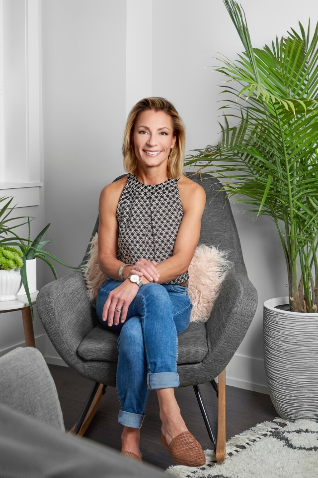
Probably the simplest shortcut to creating a bigger and brighter home is to declutter it. Granted, this won’t actually get you any more square footage, but you’ll be amazed at your newfound perceived sense of space.
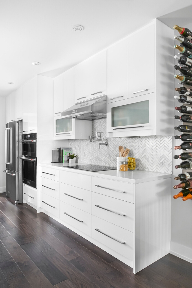
We suggest to minimize and remove items from tabletops and countertops. Minimally adorned shelves and surfaces will help accentuate your home’s architecture, furniture, and artwork by not competing for your eye’s attention. This trick is more about achieving a visual sense of space, and it works every time!
2. Flooring
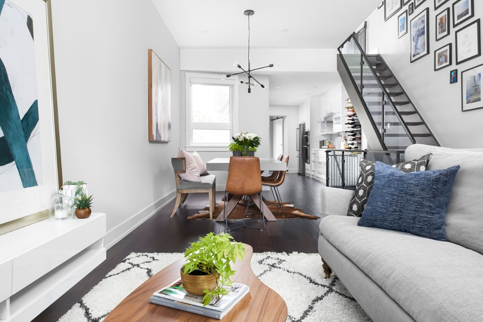
If you’re renovating your home and have carte blanche (within reason, of course), now would be a very convenient time to build “visual space” right into the design from the ground up. Starting with your floors, opt for a flooring product, dimensions, and design that elongate the space in your mind’s eye. Think “long and lean,” like grainy hardwood floors and rectangular tiles.
The way flooring is installed also has a huge visual impact on your space. Parallel or diagonal flooring is commonly known to achieve the illusion of space. Be sure to continue the same flooring material and pattern through connecting rooms to create a greater sense of continuity. Before any work starts, advise your designer or flooring professional of your aesthetic goals for the space.
3. Wall Color
Wall color is another easy way to create the illusion of more overall space in your home.
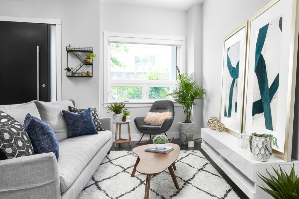
Lighter colors can make your walls visually recede, while deeper shades tend to bring them forward and create coziness. To bring a greater sense of light and air into your home, choose a neutral color palette consisting of white, beige, or light gray. This is because neutral colors reflect more light and make a room feel larger. Avoid dark paint or overly bold wallpaper, which can make a room (particularly a small one!) feel even more cramped and cluttered than it may already be.
Paint the room and all adjoining areas in the same hue to create continuity and blur the breaks from one living area to the next. Along the same lines, keep contrasts to a minimum. A monochromatic color palette from the ground up will achieve an overall cohesive, seamless look.
4. Window Treatments
While we’re talking walls, have you taken stock of your windows yet?
Windows are worth their weight in gold, in my professional opinion, flooding a room with tons of natural light, fresh air, and lively, vibrant views. Maximize the natural light in your home to make the space look and feel larger. Replace your heavy window drapes with simple white sheers, which offer the benefit of privacy without impeding the flow of sunlight. If privacy is not an issue, omit the window coverings altogether for a more modern, minimal look.
Tip: Window covering expert Specialty House Manufacturing recommends hanging your window coverings as close to the ceiling as possible, to make the ceiling feel higher than it is and make the window appear larger.
5. Less is More
When you’re finally ready to furnish the space, remember that especially in a small home, less is more. And always consider the scale of a new piece of furniture in relation to the room and your other items in it. A small home that’s outfitted with sleek, streamlined furniture will not only look more spacious, it will be more functional too. Opt for pieces featuring clean lines, clear glass, and reflective materials, which hold less visual weight than solid pieces do.
As you arrange your furniture, steer clear of doorways (for functional and aesthetic reasons), and ensure you keep traffic areas clear. Finally, and importantly, leave sight lines open to ensure you maintain that great sense of openness.
6. Storage
Whenever you shop for an item for your home, ask yourself if it can do double duty. Always opt for pieces that can serve more than one function. Multipurpose pieces are a great way to declutter your space and spend less money on items you don’t really need.
Modern designers and manufacturers have mastered the art of storage and space savings, with beautiful pieces that surprise and delight. Many furniture stores offer smaller-scale items, but there are condo-specific stores out there that specialize in small-space essentials such as d-leaf kitchen tables, storage ottomans, wall desks, compact chairs, and nesting tables.
Furnishings with exposed legs or feet are another trick of the trade. There’s something about the air flowing freely around and underneath these pieces that gives them a lighter appearance. Invest in leggy couches, ottomans, and chairs, as well as bed frames, dressers, and other furniture that keeps the eye moving.
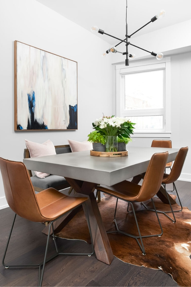
7. Accessories
The final and perhaps most overlooked way to enhance a home’s sense of space is with accessories. No home is complete without these finishing touches, and believe it or not, some strategic pieces can actually make your home appear larger.
Mirrors are an essential piece in every home, but I especially love using them in compact spaces. Their aesthetic impact is incredible, and the best part—it’s instant! This interior design tip works for all sizes of rooms and can work almost anywhere in your home, regardless of the size of the mirror. Bathrooms, living rooms, dining rooms, bedrooms—anything goes. Think beyond the walls when using mirrors.
Play with mirrored finishes and reflective surfaces in your living room, entryway, bedroom, or kitchen décor to add depth and brightness to the space. Lighting is commonly found in reflective finishes like polished chrome and, more recently, trending gold, but don’t stop there. Virtually anything can be found in a reflective finish, such as high-sheen fabrics, art and photo frames, vases, mirrored side tables; the list goes on.
Hint: Placing reflective pieces near windows will subtly bounce more light around the room.
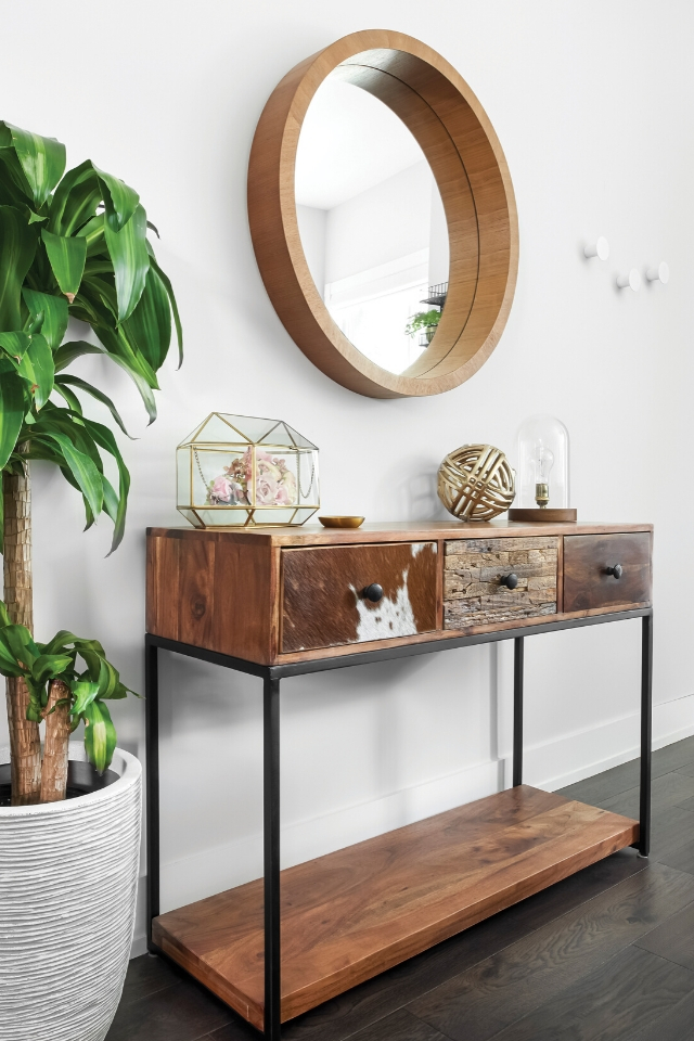
The old saying “size is just a number” is only true to a certain degree when it comes to your home’s square footage. Realistically, there’s only so much “visual space” you can get. There are many creative ways to make a small space appear larger, but the true secret to making the most of your home is to use every inch wisely. This doesn’t mean cramming every corner and surface. It means standing back and incorporating empty “white space” into the overall aesthetic. You’d be surprised at how liberating an empty corner or countertop can be.
The most beautiful homes aren’t necessarily the biggest ones. Be smart and selective with what you choose to bring into your home. Think light, open, and airy. Simplify. By freeing up visual space in your home, you’ll soon find yourself living larger than you ever thought possible—regardless of your home’s physical restraints.
Interior Design: Andrea Colman Photography: Nicole Aubrey
Andrea Colman is principal of Fine Finishes Design. With almost two decades of renovation and design experience, her full-service firm services clientele throughout the Greater Toronto Area. The growing boutique design firm is known for creating stylish, harmonious, livable environments.